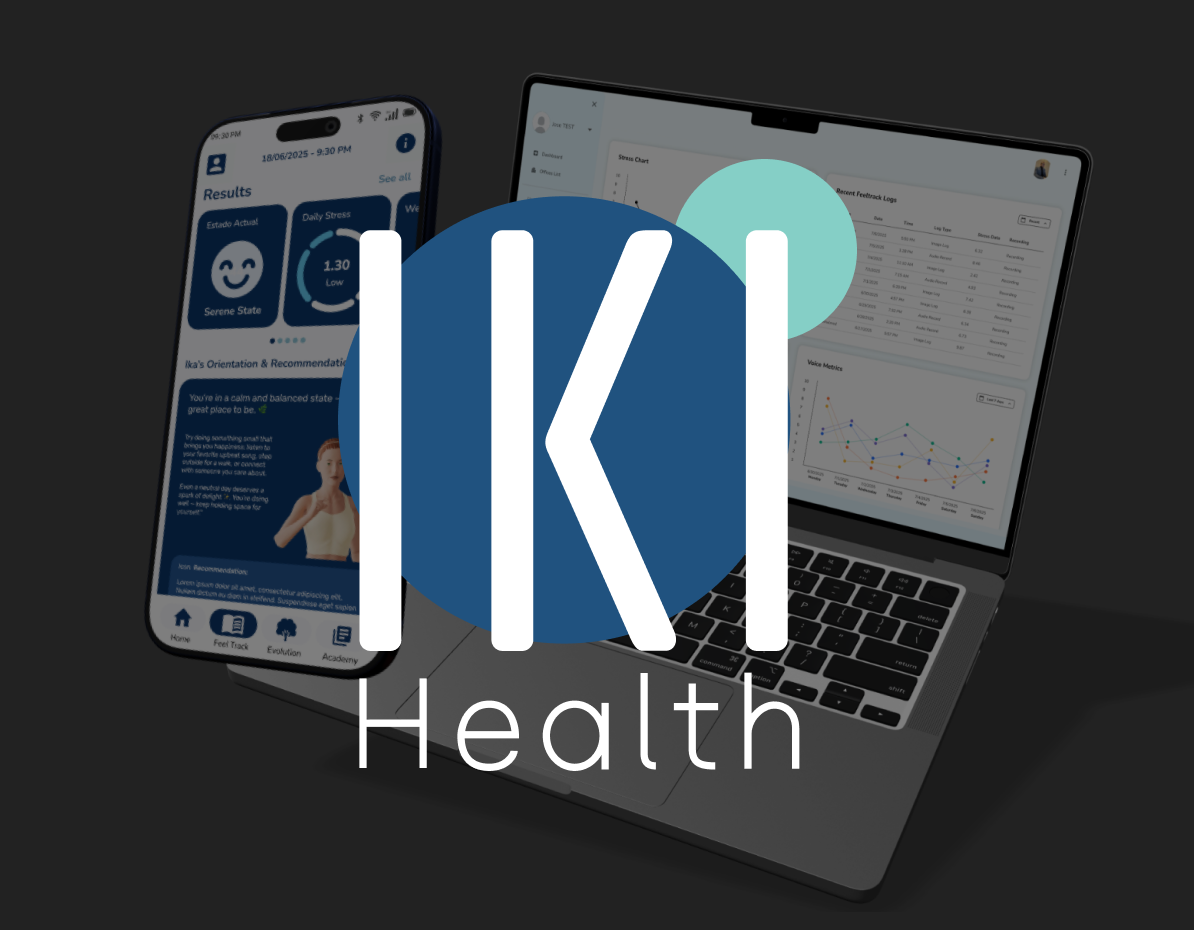
IKI Health Application
One AI output, split for two readers who needed opposite speeds.
- Role
- Product Design, UX, Information Architecture, Design Systems
- Year
- 2025
- Audiences
- 2
One AI output had to slow down and speed up at the same time.
- Problem
- One stream of AI health data had to serve a user reading in 3 seconds and a clinician who wants density.
- Built
- One AI feature designed across mobile and a clinical dashboard, plus a navigation rework. 54 screens in about four months.
- Result
- Signed off by the CEO, reviewed async across a language split.
IKI Health, backed by Amura Ventures, is a Spain-based team building an AI-assisted health product around audio journaling and stress tracking. The brief was short and loaded, asking for a new AI feature brought into the mobile app and a clinical web dashboard in about two months.
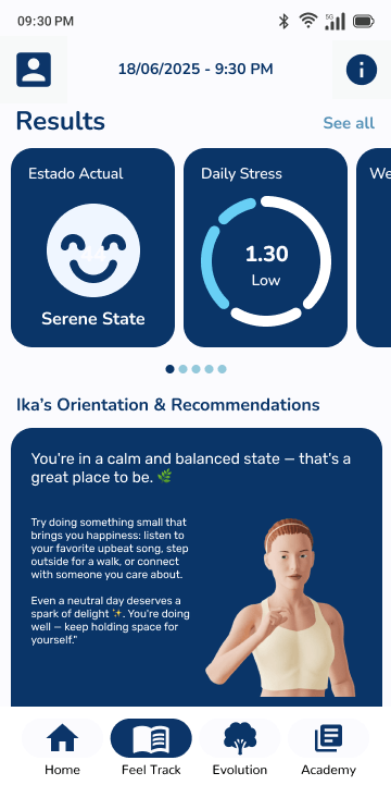
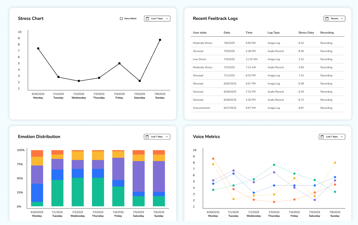
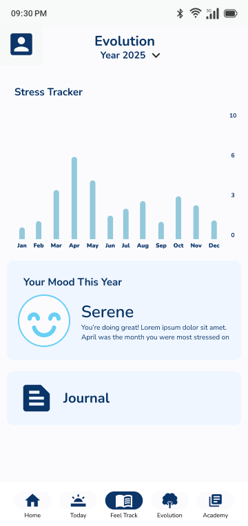
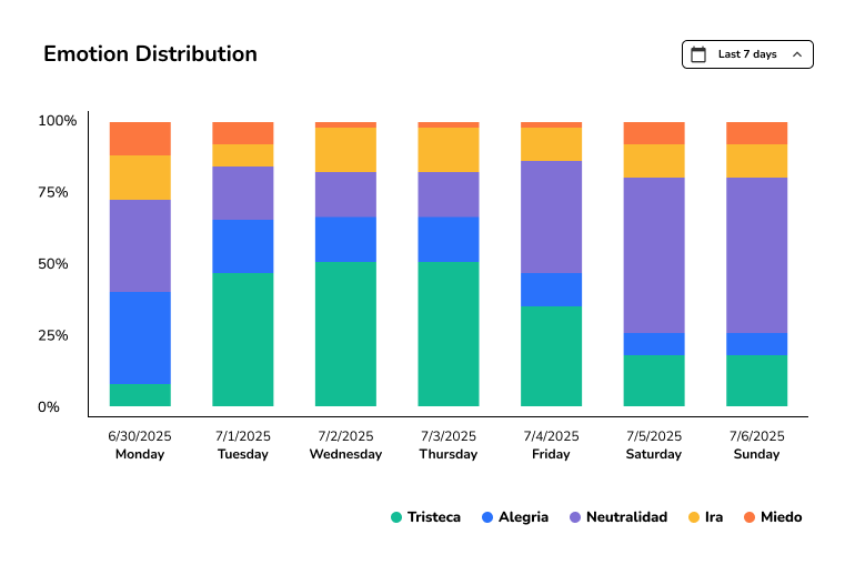
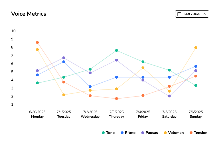
User state, daily and weekly stress, voice metrics, emotion distribution.
Everyday user
3 sec to read the result
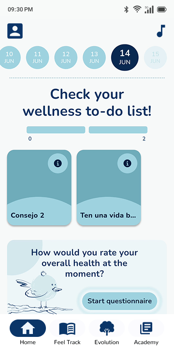
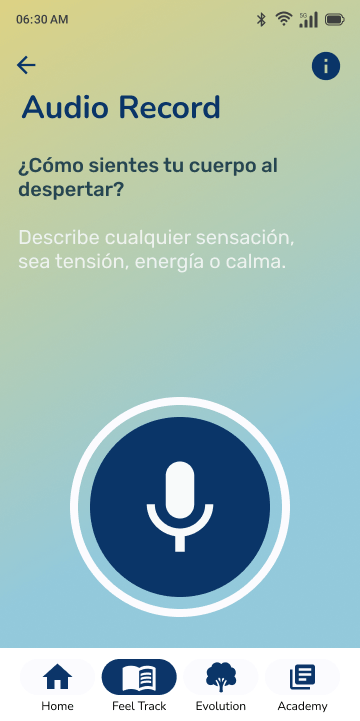
After a recording, the first screen had to explain the result fast, then place the deeper stress, voice, and emotion data lower on the page.
Health professional
Dense because depth helps
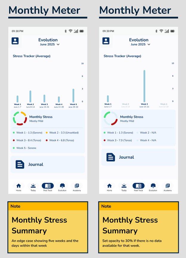
Density helps here, so the clinical dashboard kept the same numbers close to existing patient charts and professionals could compare daily and weekly stress, voice metrics, and emotion distribution.
Two audiences read the same numbers differently.
Three pressures sat under one brief. The user trusts a result they can take in fast, the professional trusts one they can dig into, and the old navigation had room for neither.
User trust
Trust on mobile meant restraint, so a headline result comes first and everything else earns its place below it.
Professional trust
Trust in the clinic meant depth, enough detail to verify the AI output instead of taking it on faith.
Navigation
Stress tracking and audio input had no natural place in the old app structure, so the layout had to move with the feature.
The three-second mobile results screen beside the clinical web dashboard. Same AI output behind both.
Navigation before and after, plus the action-ball prototype. I tried it for quick access, set it aside, and wrote up why.
- ~4 mo Brief to handoff
- 54 Screens and edge-case states
- 2 Distinct user flows
Four decisions carried the work.
- 01
Built a baseline that didn't exist
I rebuilt the live app in Figma, then used that file as the reference for product review and new feature work.
The live app rebuilt in Figma, so the team had one file to point at. - 02
Designed the AI feature from scratch
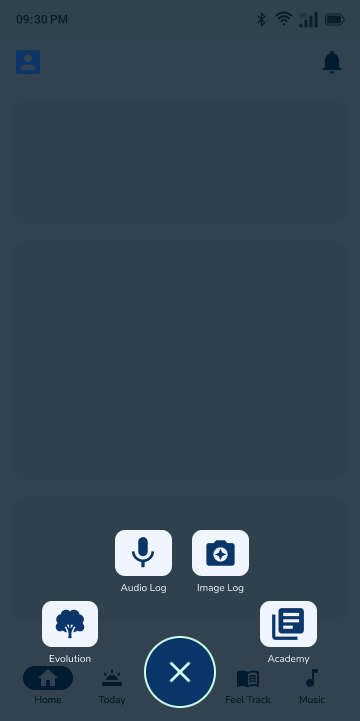
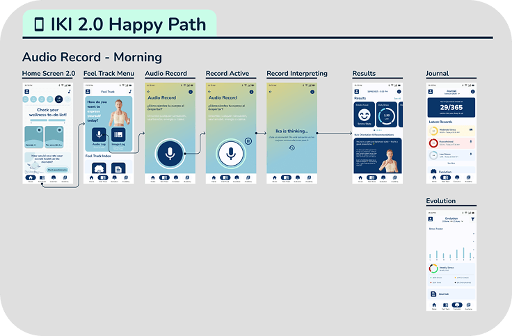
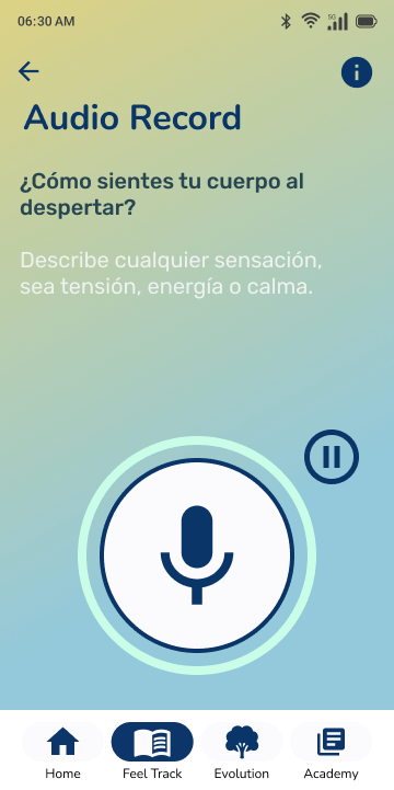
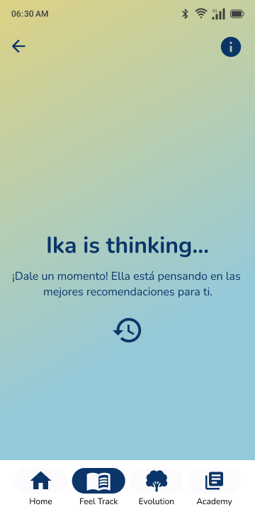
I drew the audio journal path from idle state to result, including time-of-day states, recording edge cases, and both result views.
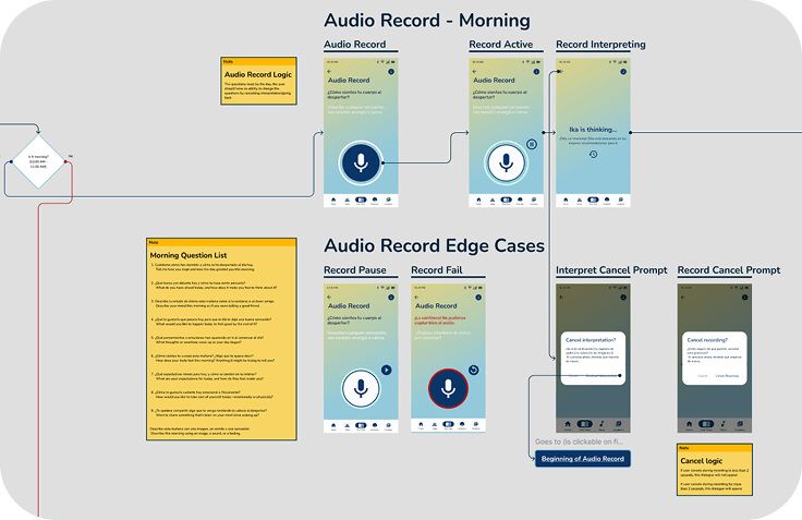
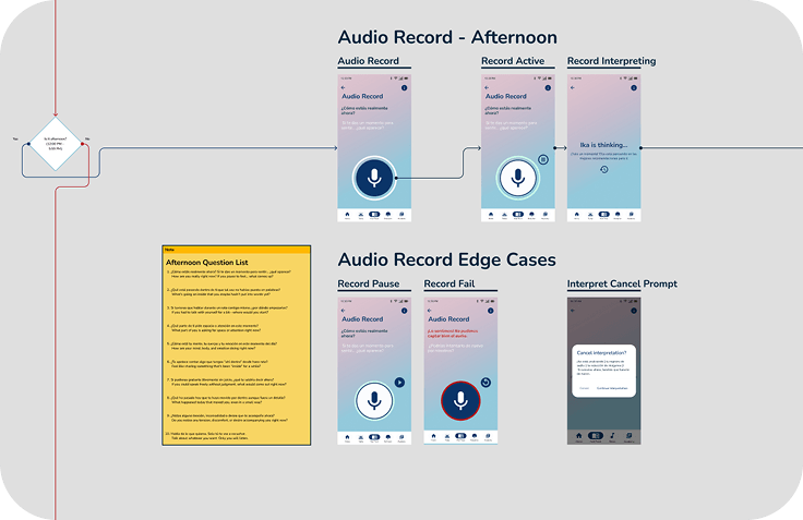
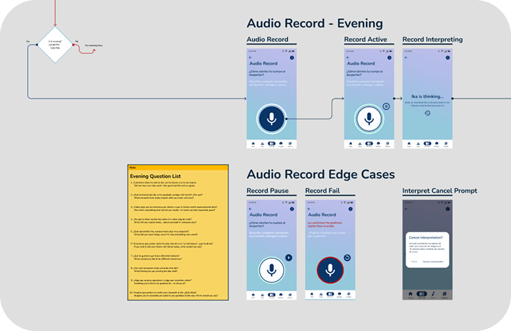
Twenty-five edge-case states laid out in one grid.
- 03
Redesigned navigation in parallel
I reworked the core navigation while placing stress tracking and audio input where users would expect to find them.
- 04
Treated documentation as design work
Stakeholders and developers worked in Spanish, and the PM was bilingual, so I wrote the decisions into annotated screens and logic maps for async review.
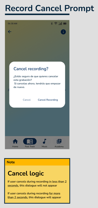
An annotated screen and flow logic map. This is what the Spanish-speaking team reviewed and signed off on, without a live walkthrough.
Screens, grouped by what each reader needed to understand.
States shift by time of day and what the user has already done, so the flow picks up where the user is instead of restarting from zero.
This screen was the hardest call in the feature. The AI returns a lot at once, so it reads top-down in priority order with the deeper data tucked below the headline.
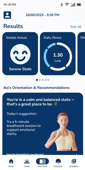
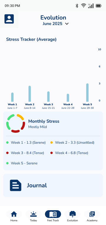
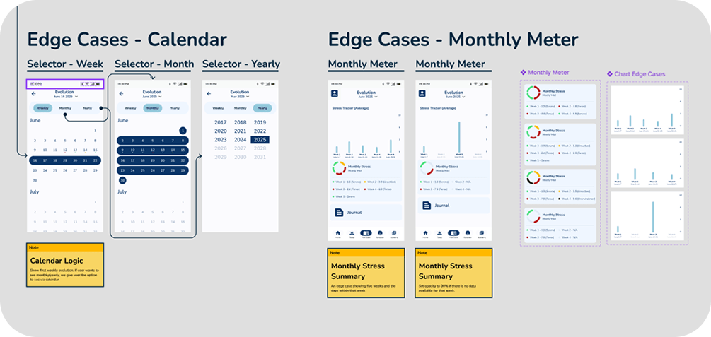
Users come back to see whether things are getting better or worse, so the charts show the trend and keep the math out of the way.
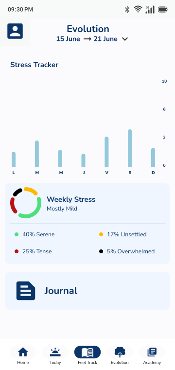
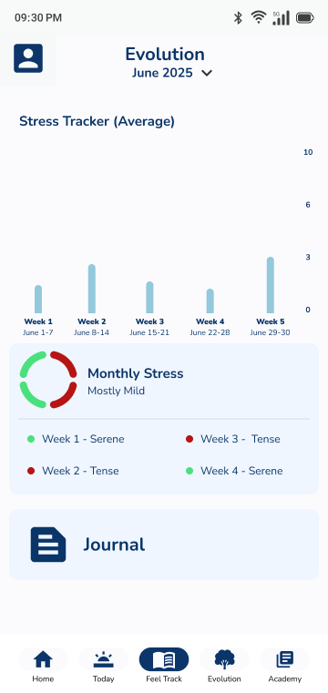
The same data as a working tool. It sits inside the backend's established patterns, so professionals can cross-reference against existing charts. Density that would overwhelm the mobile screen is what a clinician wants.
One design system carried both speeds.
Both audiences read from one source of data: a results screen a user can read in three seconds, and a clinician dashboard dense enough to cross-reference against existing charts. The design system grew to hold both rather than splitting into a second product language.
Because decisions lived in annotations and flow maps, the Spanish-speaking team reviewed and approved the work asynchronously, and the CEO signed it off from those documents.
- ~4 mo Brief to handoff
- 54 Screens & edge-case states designed
- 2 Distinct user flows, one design system
- CEO Sign-off, reviewed async across a language split
The CEO signed off on the work, and the whole review ran in writing across a Spanish and English split.