CateredByMatt Website Revision
A premium caterer's site has two jobs that pull against each other. It has to look expensive and it has to convert.
- Role
- UX Research, UI/UX Design, Design Consulting
- Year
- 2026
- Status
- In review
Read expensive and convert. Two jobs that pull the same site in opposite directions.
- Problem
- Blog bounces hard, the #1-ranked pages look average, and the contact form asks the hardest questions first.
- Built
- Navigation, blog template, a 16-suburb locations directory, and a multi-step enquiry funnel, each with a written spec the client's developer can build from.
- Result
- Designs in client review, moving into a phased build.
CateredByMatt sends a chef and front-of-house staff to cook and serve at the client's own venue. A real chef cooks on site, so what the client sells is presence, and the site undersold it.
The brief arrived as a Loom, a narrated screen recording. The client walks the site and names three pages in priority order: the blog, the locations, the last-minute page.
Different jobs need different references, so the research kept them in separate classes.
Read expensive
~2 calls to action per article, tops
Aesop's library, Mr Porter, and the fine-dining sites teach how a premium brand publishes: restraint, generous type, and calls to action that are few and considered. This register is what the blog has to reach.
Convert
$3k+ enquiries worth the chef's time
yhangry, Togather, and the catering marketplaces show how an enquiry becomes a booking, so multi-step funnels, early qualification, and urgency kept intact. The site has to do that too, because that side is what pays for it.
The risk on a project like this is that the editorial references rewrite a brief that is really about lead generation, so keeping the two classes apart is what stops that.
The plumbing came before any styling.
Six faults turned up that no visual redesign would touch. None of these are style problems. Each one leaks either trust or an enquiry, and each got its own written fix.
- NAV / 01
Blog traffic is real, and no header link points at it.
- NAV / 02
Two dropdown parents point at "#", so the menus open onto nothing.
- NAV / 03
Party Catering links back to the very page it lives under.
- LOC / 04
Identical calls to action stack down all 16 suburb pages with no path through them.
- FORM / 05
Name, email, and phone demanded first, exactly where drop-off is highest.
- FORM / 06
Phone field defaults to +63 on a business that only serves Sydney (+61).
- In review Where the designs sit now
- 6 Workstreams, research through handoff
- 16 Suburb pages in the locations directory
- #1 Sydney last-minute ranking to protect
Six workstreams, each with a written spec behind it.
- 01
One mega-menu instead of four dropdowns
Four overlapping dropdowns collapsed into one full-width Catering menu, organised by the two questions a buyer actually asks: occasion and style. That freed the top bar for Journal, About, Last Minute, Locations, and an Enquire button. No URLs change, so nothing ranking is put at risk.
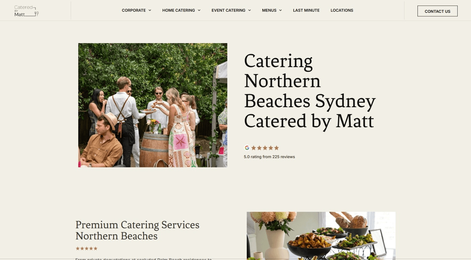
The mega-menu draft, built with the live page list and real URLs rather than placeholder labels. - 02
Blog template that earns its traffic
Traffic was fine, but conversion wasn't. The editorial references point to about two calls to action per article while the house style ran six, so that conflict got resolved by keeping the count modest and making each one unmissable. The template was drafted against a real post, a 40th birthday party ideas article, before rolling the pattern out.
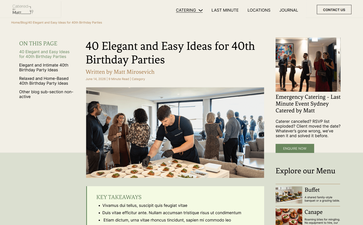
The article template draft. Premium register on top, with the conversion layer kept distinct instead of frequent. - 03
Locations hub with a real map
Sixteen suburb pages needed a filterable map, not a static image. I weighed three builds and chose a Google My Maps embed, more editable than a static export and far less to maintain than a full JavaScript map. It has one caveat, that the base tiles can't be restyled, so the premium feel comes from the frame, the markers, and the filter UI.
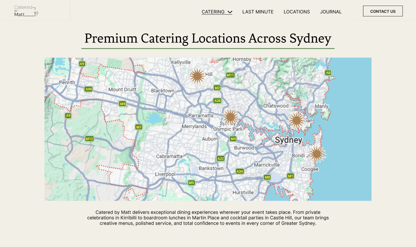
The locations hub draft, with one map, a layer per category, and a filter UI matched to the Figma. - 04
Lean, local-first suburb pages
Sixteen near-duplicate suburb pages are a ranking risk, since search engines can't tell the repeated menu cards and copied blocks apart and may demote all of them. The fix cuts each page to what's local to that suburb: a location-specific hero with its own H1, reviews pulled up high, the photo gallery, one closing call to action. A third-party SEO review later reached the same structure independently.
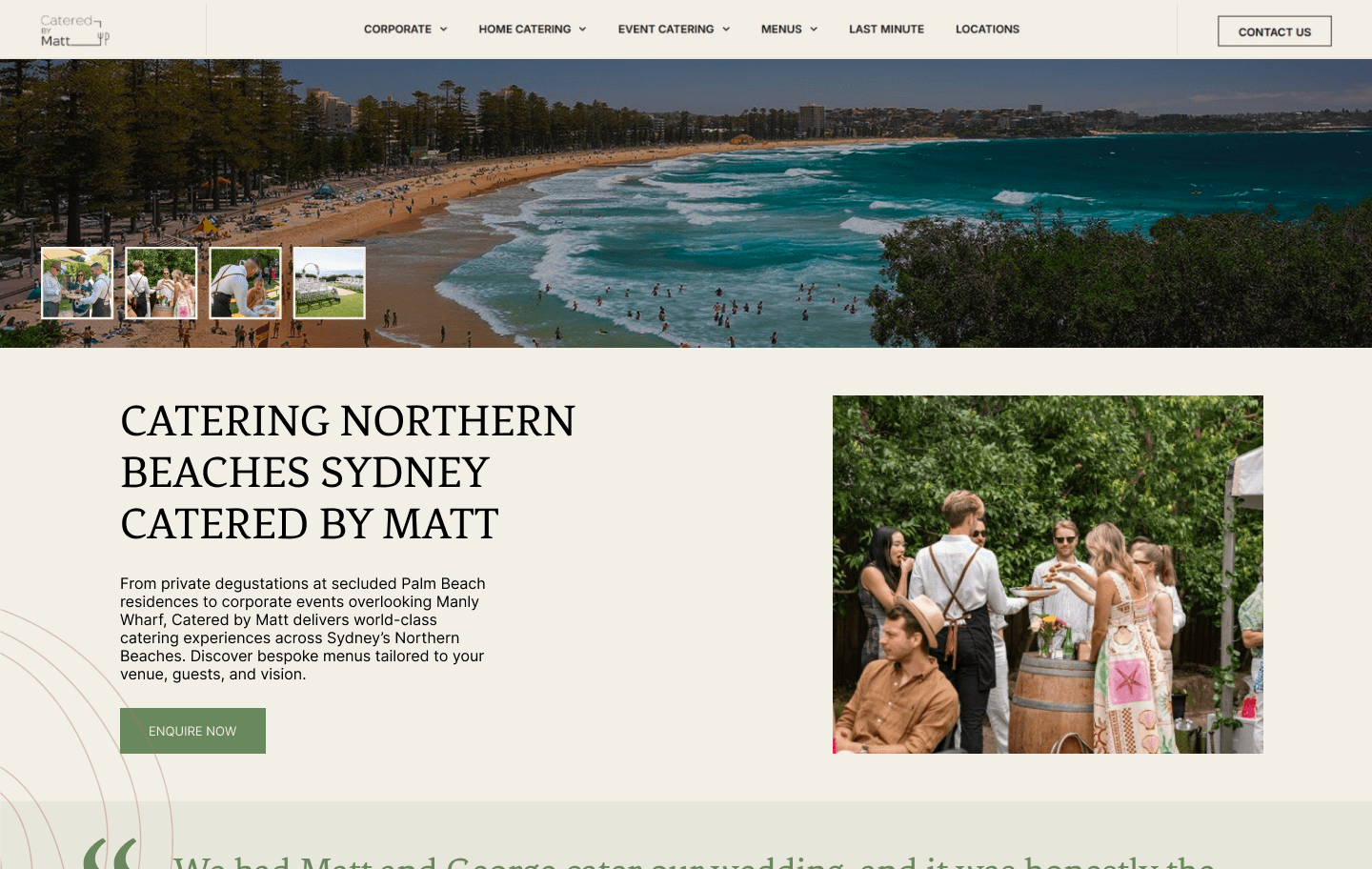
The suburb-page cut: local hero, reviews high, gallery, one closing call to action. - 05
Funnel instead of a flat form
One small question per screen, contact details last, and a progress ticker up top turned the flat contact form into a multi-step funnel. Wrong-fit enquiries screen out early, outside the service area or under the roughly $3k floor. It deliberately doesn't gate a first visit, since weddings are considered purchases and people get to browse first.
- 06
Last-minute page that keeps its urgency
The page ranks first for last-minute and emergency catering, then leaks that urgency by routing every call to action to the generic contact page. The page needs to keep an urgent promise while the styling stays calm, without countdowns or red. A response-time promise sits near every call to action, the phone is the primary path because urgent buyers call, and an on-page enquiry route arrives pre-flagged as urgent.
Third-party SEO review, triaged by weight.
Third-party SEO review came in on the blog and locations drafts, and I triaged it by weight instead of treating every point as equal.
Most recommendations were worth taking as-is. Two rationales were weaker than the evidence, so those recommendations stand but the reasoning now leads with the reader instead of a search penalty.
Taken
- A takeaways summary box above the article intro
- A table of contents in the sidebar, replacing a generic link list
- A bordered container for the mid-article service embed
- The author byline linked to a real bio page
- Breadcrumbs marked up as BreadcrumbList, not plain text
Pushed back
- The claim that sidebar links signal "low quality" to crawlers
- "AI loves this" as a justification for anything
- More calls to action. The answer stayed distinct over frequent
In client review, moving into a phased build.
Every recommendation went out as either a plain-language client note or a developer handoff spec. The spec names the method behind the look, so the client's WordPress developer builds from the document instead of booking time with me. The calls still open are written down too.
- Whether the near-duplicate corporate pages compress. That touches live URLs, so it's a client and SEO call, not a design one.
- Whether CateredByMatt takes events beyond Greater Sydney, which gates the custom-quote box the review proposed.
- Whether the client's developer works in code or a page builder, which decides if the full funnel ships as designed or as a lighter fix.
Metrics land at launch: blog bounce, funnel completion against the old flat form, page speed, and whether the last-minute ranking holds through the redesign.
Nothing here is measured yet. The metrics block fills once the redesign is live.