Shopworks ERP System Design
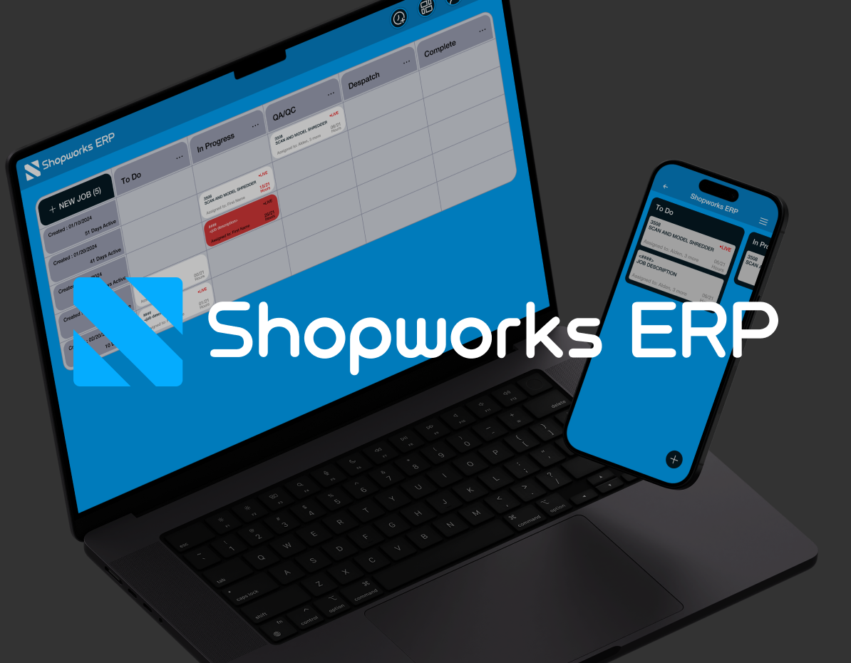
I designed a SaaS ERP for Rubix Designs across all three surfaces. The interfaces are dense and data-heavy, and operators move through them fast.
- Role
- UX Design, UI Design, Web Design
- Discipline
- UX / UI
- Year
- 2023-2024
- Headline
- 3 Surfaces, one system
Context
Shopworks ERP is enterprise resource planning software built for Rubix Designs, and it runs the operations of the business. The deliverable spanned the whole product, the front-facing website, the main SaaS, and the admin-side back end. These are tools people live inside all day, so the job was organizing the density rather than reducing it.
The problem
ERP interfaces fail when they treat every piece of data as equally urgent. The screens needed to show everything without exhausting anyone, so the layout had to carry experienced operators rather than fight them. The marketing site and the admin back end also had to belong to the same system.
Process
- 01
Designed for the daily user
I aimed this at the person who uses it for the hundredth time, not the first, so speed, scannability, and muscle memory came before hand-holding.
- 02
Imposed a clear structure
Consistent patterns for tables, forms, and actions, so someone who learns one screen already understands the next, across the product and the admin back end alike.
- 03
Connected site to system
The front-facing website carried the same visual logic as the product, so the promise on the marketing side matched the tool a customer signed up to use.
The work
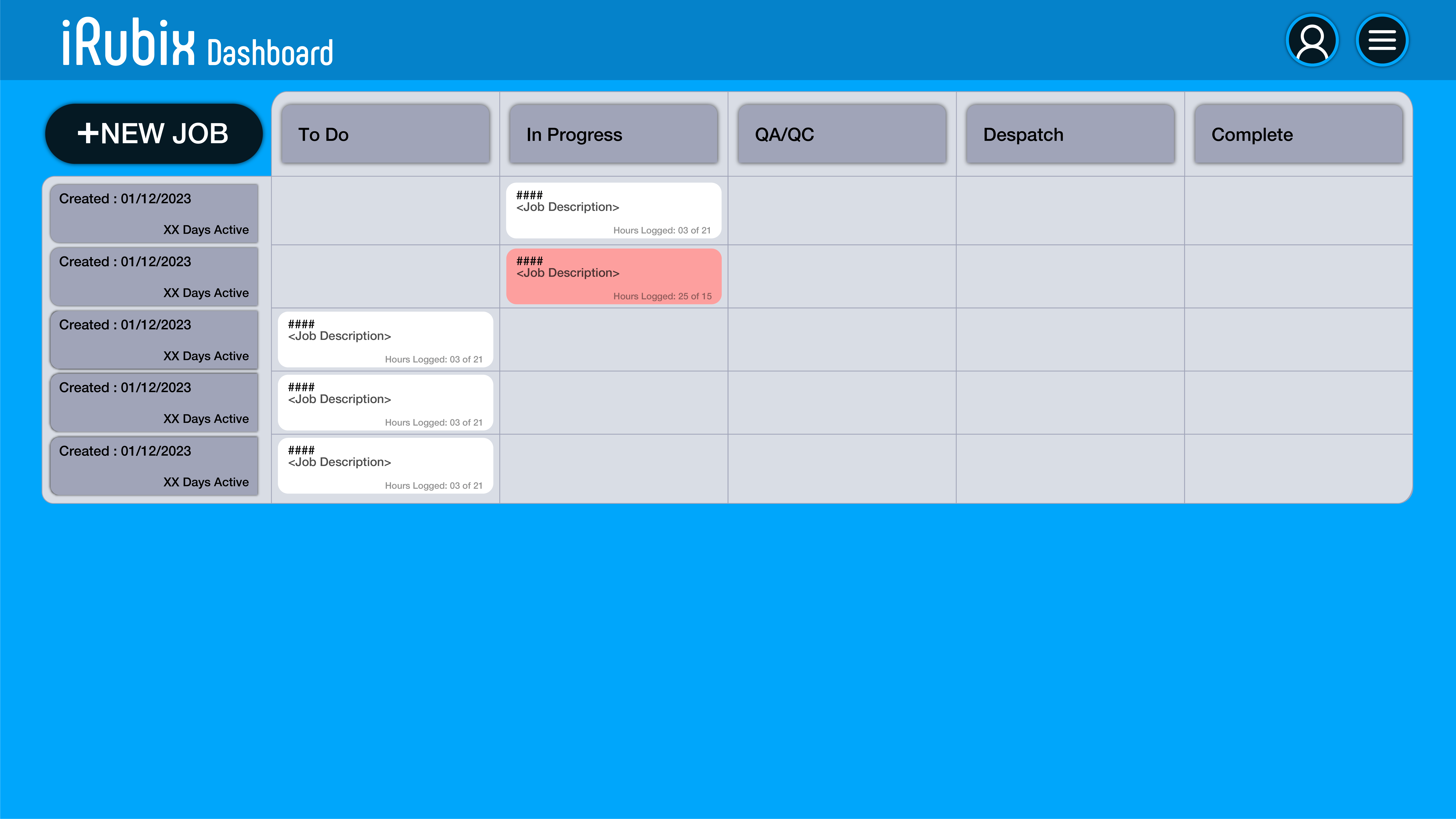
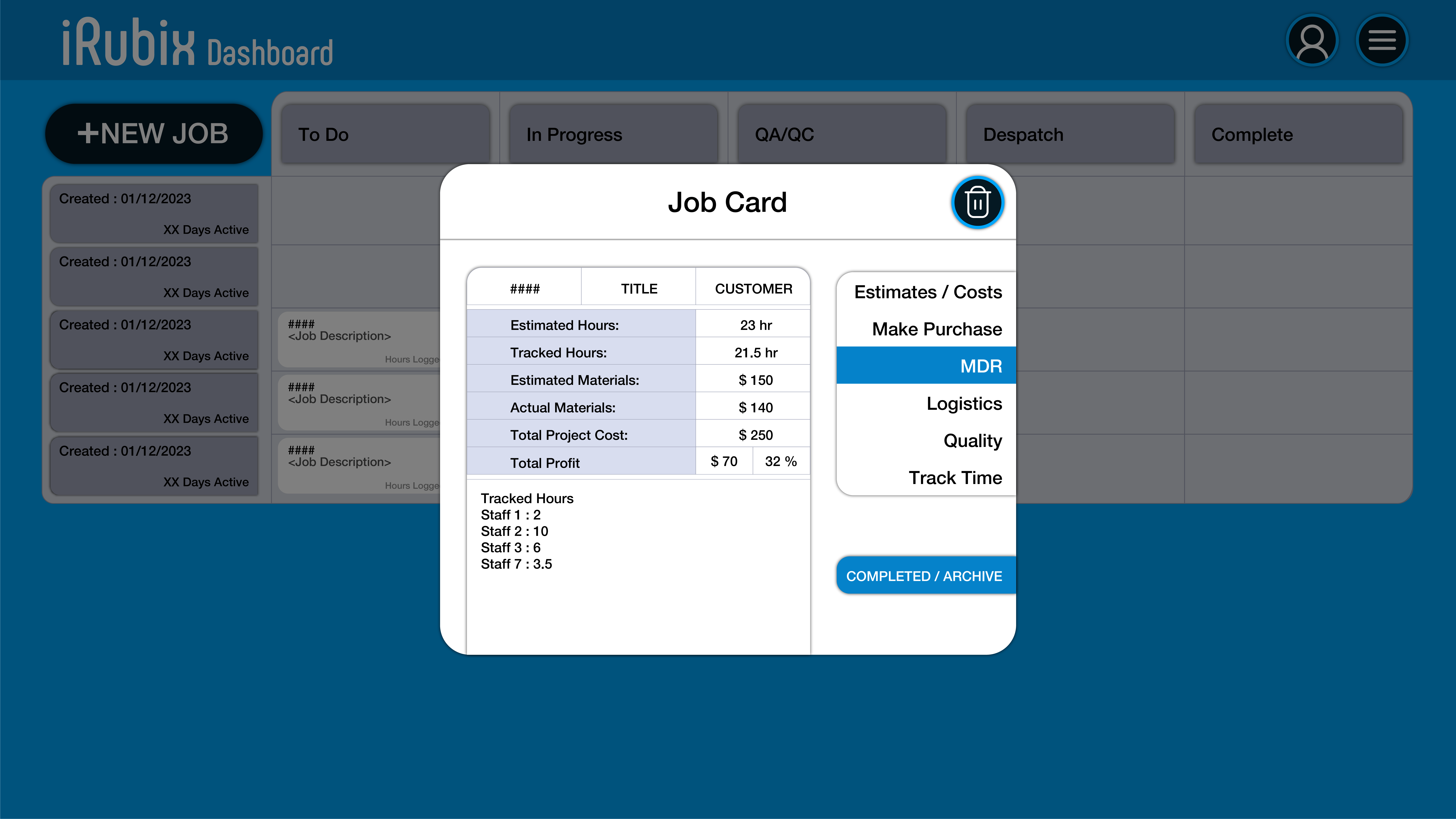
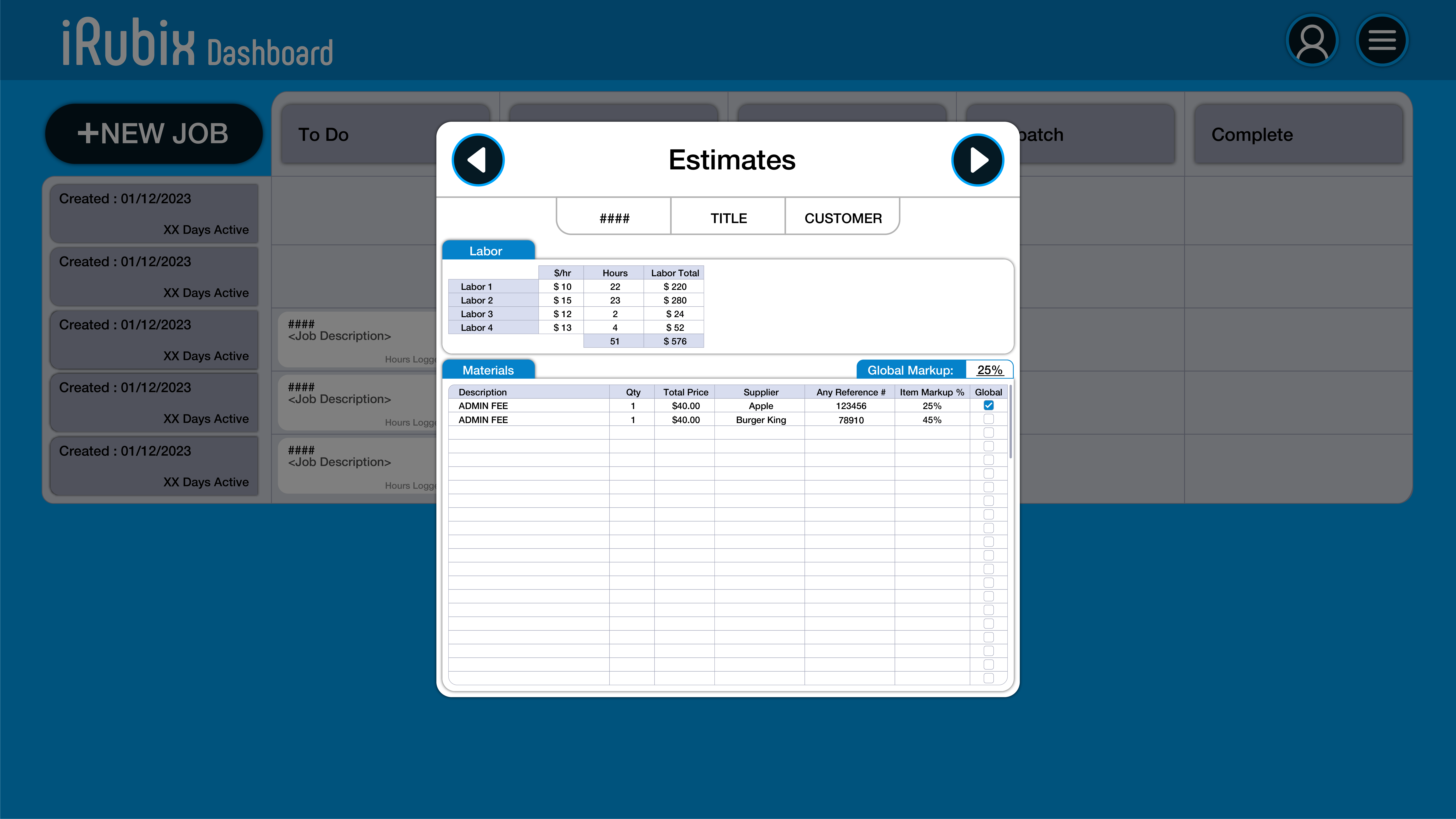
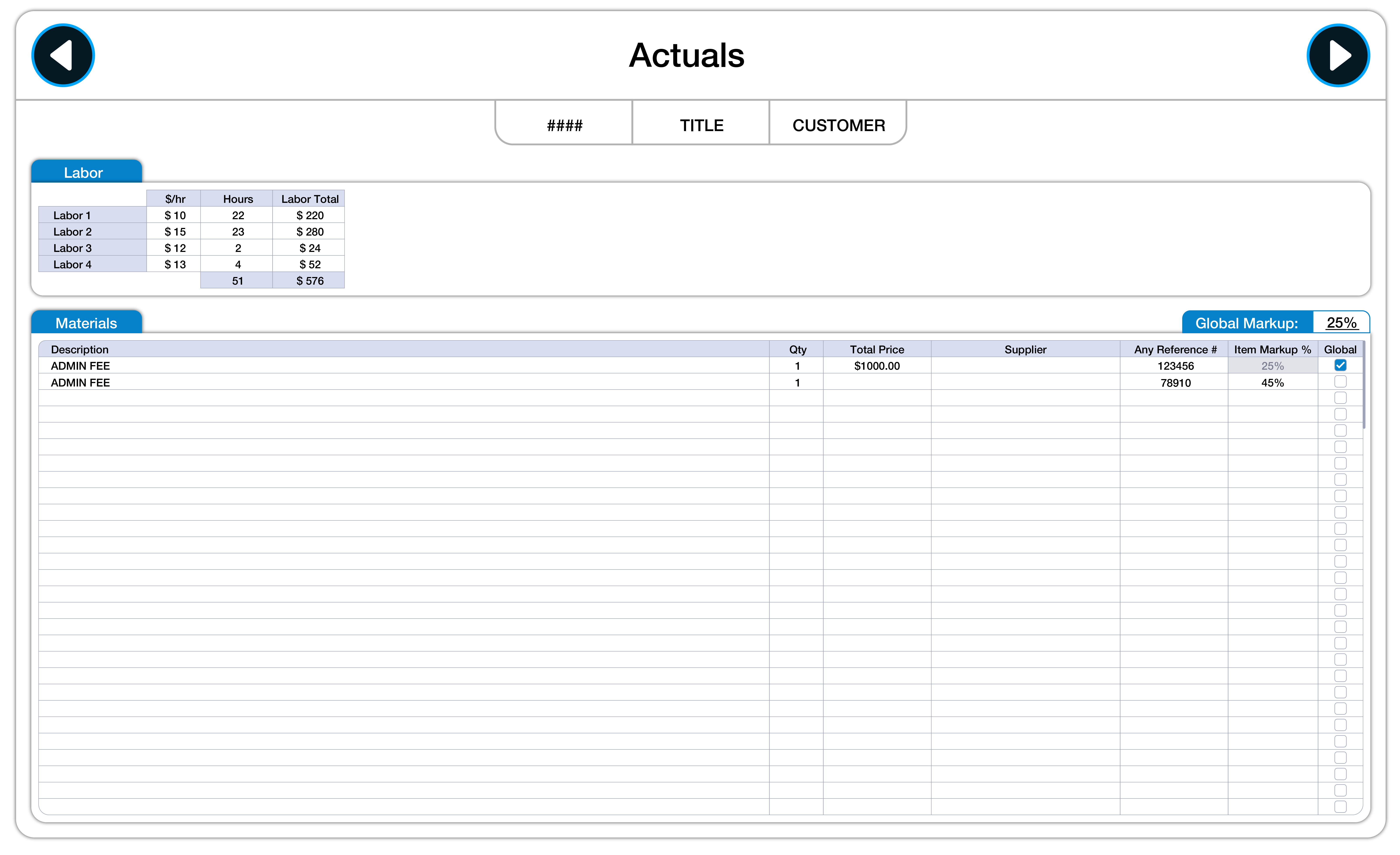
The job board and the dense screens operators move through all day.
Outcome
The interfaces hold a lot without feeling heavy. Operators find and act on what matters faster, and the same organization runs from the marketing site through to the back end.
- Faster Day-to-day task flows
- End-to-end Site, product, and admin
The screens are dense because the work is, so the priority was keeping them clear for operators who are in them all day.